Magazine layout

Year 2, semester 2: Course assignment 05, magazine layout
Task overview
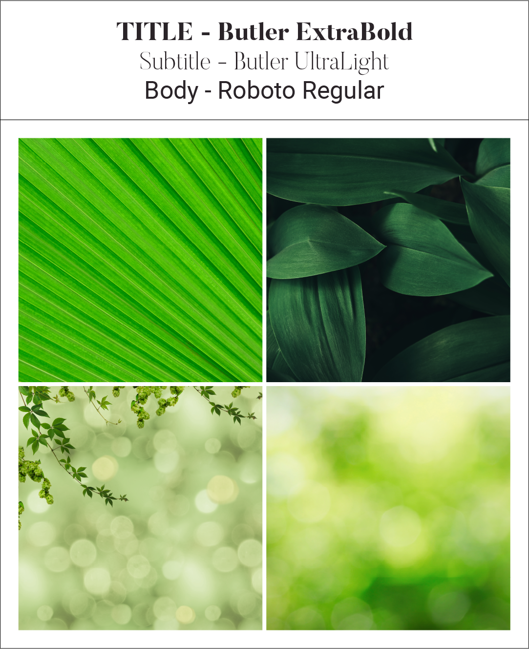
For this assignment we were provided articles for a magazine. It was up to us to gather images, either by through the web or by producing our own images and illustrations.
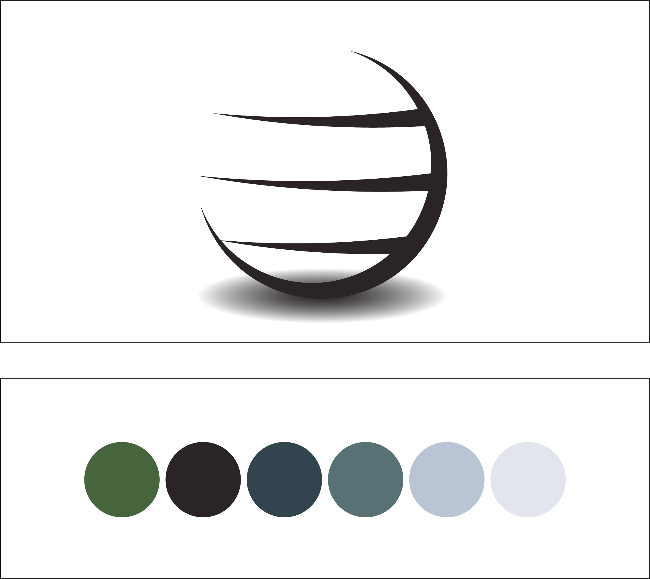
As part of the assignment we also had to come up with a name for the magazine and create a logo.
My work
For this assignment I chose to gather my images online and give credit accordingly. I have created a logo and a name which fits together and I have picked a color scheme which I believe is fitting to the theme of the magazine.
Throughout the magazine I have focused on a professional structured text layout due to the nature of the magazine, while trying to be creative through image positioning.
The created logo is simple, but still has a strong tone and connection to the magazine. I believe that the logo became more serious due to using a globe as the base of the logo. The globe represents the people, therefore the logo indirectly is also representing the people. The name "Global" also therefore became rather fitting as a magazine name.

The fonts used are serious with an option for something more artistic for quotes, roboto is a very easy to read font and therefore a good option for magazines with a lot of body text.

I have also made sure to add a decent amount of full pages images to space out the articles and create breathing room. The images are also focused around the color green due to the theme of the magazine.

The chosen color scheme also has a very earthly ring to it and the colors has been picked from an image of a lake with a forest in the background.
CA05: Design elements 01
Logo and color scheme
CA05: Design elements 02
fonts and images
Color inspiration